
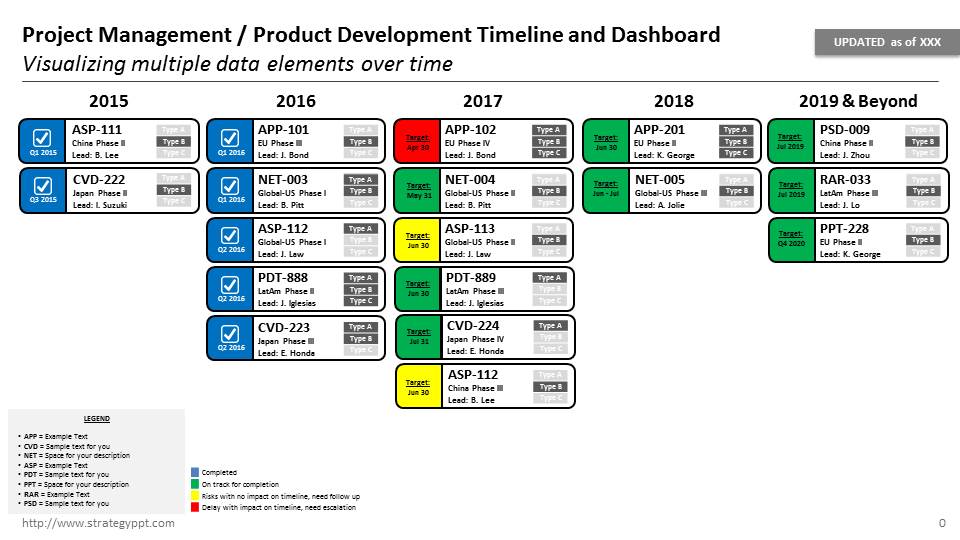
Throughout the course of my consulting career, I have had to create many project timelines. Typically, I would create gantt charts in MS Excel or MS project. The problem is that project timelines are inherently not good visuals for presentations. Often times, the challenge is to summarize the details into a slide for management to understand the key issues/risks. Hence, I like to call it a timeline + dashboard (time-board or dash-line). Time is on the Y axis, and generally, I would bound it in years or quarters and/or months (I wouldn’t go to smaller increments of weeks or days – which is typically too detailed). Then I would depict the activities in boxes. In the example attached, each Box is a Product (e.g. Pharmaceutical Product Development timeline/dashboard) but you can use it for whatever task that needs to be completed (e.g. Contracts that need to be signed, Country launches or “go-lives”, roll-outs of software functionality, etc.) Within the boxes, I put different types of info:
- Status: Red/Yellow/Green/Blue traffic lights to denote risk and/or completion status
- Lead or Owner: Allows management to quickly see who is responsible and to see if there are any resource constraints.
- Product Names or Activity Names: Visual way to see where the products are over your timeframe.
- Type: In case you need to show additional information about the products, there are radio type buttons to visually help management understand further categorization.
I hope this template is helpful for you, please download it here.
In addition, I have been recently fascinated with Data Visualization and I would highly recommend this book, Storytelling with Data: A Data Visualization Guide for Business Professionals by Cole Nussbaumer Knaflic. The book can be found here on Amazon.

Cole provides really practical examples of how to improve your data/charts via shapes and color and tips on how to focus the reader’s attention. Please also check her workshop on this topic at Google:
